Scattergram of numerical data
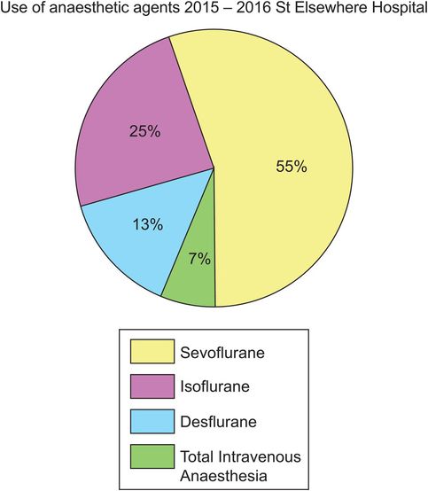
Pie chart of categorical data
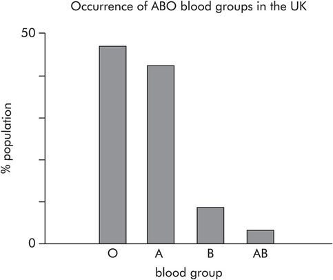
Bar chart of categorical data
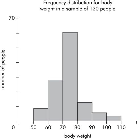
Frequency distributions
Plotting numbers of data points in each category for categorical data produces a histogram showing the frequency distribution. Continuous numerical data may also be represented in this way by dividing the variable into ranges and plotting the frequency of data points occurring in each range. Figure 43.8 shows body weights for a sample of people. In this sample the number of people in each range (vertical axis) is plotted against body weight (horizontal axis). The following points can be made about frequency distributions:
The area under a frequency distribution is proportional to the total number of data points (total number of people) in a sample.
For large samples or whole populations the frequency distribution tends towards a smooth curve.
A frequency distribution can be normalised by converting frequencies to relative frequencies, dividing each frequency by the total number of points in the sample. This makes comparisons between samples easier.
When sample sizes are large the normalised frequency distribution approximates to the probability density function for the population.
Probability
Statistical methods are required because of biological variation between individuals. We cannot obtain black and white answers from our interpretation of data, we can only obtain a probability of a value being representative for a population, or for a hypothesis being true or false.
Probability is usually expressed as a number from 0 to 1. If the probability of an event occurring is 0 it will not occur, and if the probability is 1 the event is certain to occur.
In any individual, the probability of death occurring in their lifetime is 1 (P = 1).
The probability of ‘heads’ occurring when a coin is tossed is 0.5 (P = 0.5).
The probability of being blood group B in the UK is 0.08 (P = 0.08).
It is often useful to plot the probabilities for a variable having a specific value or falling into a particular category, as this gives an overall view of how the variable is distributed throughout the population. This curve is called a probability density curve.
Probability density curves
A probability density curve plots the probability of occurrence (probability density) against the value of variable for a population. Frequency distribution curves for samples from a whole population approximate to the probability density curve if the frequencies are converted to relative frequencies and the sample numbers are large.
Probability density curves are useful in describing the distribution of data values in populations. Naturally occurring data tend to follow recognised probability density curves, which can be defined by characteristic equations. These equations represent families of curves which depend on the values of parameters in the equations.
Probability density curves can also be derived for statistical parameters such as t and χ2. These parameters are sometimes simply referred to as statistics, and are calculated from the data obtained in research studies. Such curves enable probabilities to be derived for specific values of the parameters. These probabilities (or P-numbers) are the end product, when data are statistically tested for the null hypothesis (see below).
A probability density curve has the following properties:
The height of the curve at any point equals the probability of that value of x occurring.
The maximum height of the curve cannot be greater than 1.
The area under the curve between any two values of x equals the probability of x occurring in that range of values.
The total area under the curve equals 1, since the curve covers all probabilities for the variable x.
Recognised probability density curves
Normal distribution
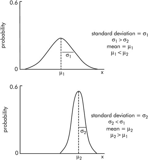
The normal distribution is the most common probability density curve in biological data. It is based on the idea of a representative or average value for a population, and is a symmetrical bell-shaped curve.
The normal distribution describes many numerical variables – e.g. blood pressure, body temperature, body weight, haemoglobin level – and it is central to many statistical methods. The curve is defined by its mean value (μ) and its standard deviation (σ). Figure 43.9 shows two normal distributions with different mean values μ1 and μ2 (μ2 > μ1), and different standard deviations σ1 and σ2 (σ2 < σ 1).
Normal distribution
For example, consider plotting a probability density curve for systolic BP, over the whole population in the UK (this can only be approximated to by taking a very large sample). If the probability density is plotted against systolic BP, a normal distribution curve is obtained (Figure 43.10). The mean, mode and median are 120 mmHg. There are much lower probabilities for pressures 180 mmHg or 60 mmHg occurring. These occur in the outermost portions of the curve, called the tails. The shaded area equals the probability of systolic blood pressures > 180 mmHg occurring. The hatched area equals the probability of systolic blood pressures < 60 mmHg occurring.
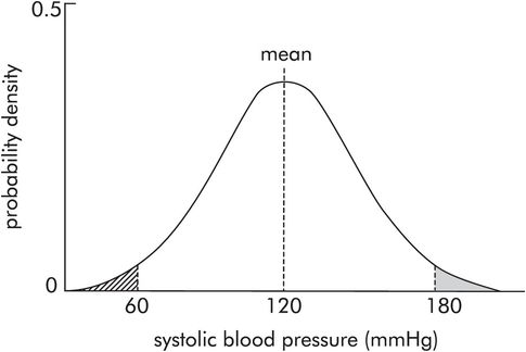
Probability distribution for systolic blood pressure
Binomial distribution
These curves describe the probability distribution of proportions. Proportions occur in a sample in which a binary variable is recorded. Binary variables only have two possible values or states, e.g. 0 or 1, dead or alive, diseased or disease-free, ventilated or spontaneously breathing. Consider recording deaths in a sample (n) of ICU admissions. A number (r) will have died and a number (n – r) survive. These curves plot probability against the number of individuals (r) with the chosen outcome. The binomial distribution curves alter shape according to the total number (n) of individuals in the sample, and the probability (π) of the chosen outcome occurring. Figure 43.11 shows a binomial distribution plotting probability against r. It is skewed for π < 0.5 or π > 0.5 and becomes symmetrical at π = 0.5. The shape of the distribution curve also varies with n and tends towards a normal distribution as n increases (> 40).
Poisson distribution
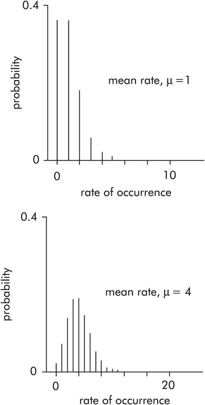
This is used to describe the probability distribution of rates of occurrence, e.g. the respiratory rate of a patient (breaths per minute), the number of ICU admissions per week, the incidence of prostatic cancer per year. The Poisson distribution plots probability against the rate of events occurring. These probability density curves only depend on the average rate of events recorded over a period of time (μ). The distribution is skewed for low values of μ (< 10), but tends towards a normal distribution when μ is high (> 20) (Figure 43.12).
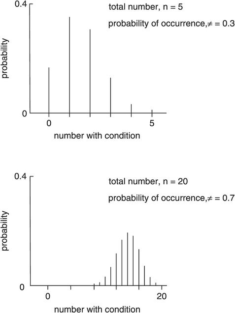
Binomial distribution
Describing numerical data
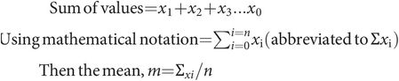
Consider a set of values for a variable x. The values are x1 + x2 + x3 … xn and have been divided into ranges and plotted as a frequency distribution in Figure 43.13. These data can then be described by two main characteristics:
An average or representative value
A measure of the spread of values
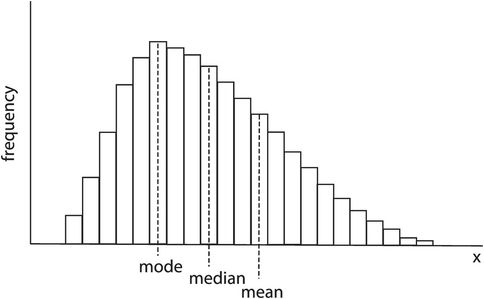
Mean, mode, median – skewed distribution
The average value
There are three choices for an average or representative value:
Mode – This is the most commonly occurring value in the set of data values.
Median – This is the value in the data set which has an equal number of data points above it and below it. It is sometimes called the geometrical mean, as the area above the median equals the area below.
Mean – This is short for the arithmetical mean value, and is the most useful of these choices.
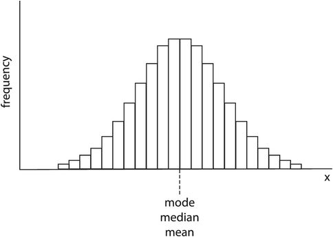
In Figure 43.13 it can be seen that the frequency distribution is not symmetrical but is skewed. The mode, median and mean are all given by different values of x. Medical variables usually have a normal-shaped frequency distribution, which is symmetrical and has mean, mode and median values all coinciding (Figure 43.14).
The spread of values
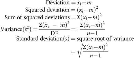
The spread of a set of data can be calculated numerically in the case of a normal distribution, and is given by the standard deviation (s), which is derived from the variance (s2).
Consider the above set of data, consisting of n values for a variable x. Then, using the above calculation, the mean, m, can be calculated. The variance is calculated from the deviations of each value from the mean and the number of degrees of freedom (DF), where DF = n – 1.
The deviation of each value from the mean is given by
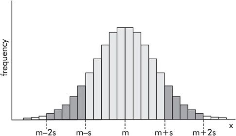
In a normal distribution the standard deviation gives a measure of the spread of values. Figure 43.15 shows the frequency distribution for a normally distributed variable x, in which the mean value is m and the standard deviation is s. Then 68% of the values lie within the area m ± s (light shaded area), and 96% lie within m ± 2s (light and dark shaded areas). The smaller the standard deviation the more the data points cluster around the mean value, and the narrower the frequency distribution.
Sampling
Recording a number of numerical values from a whole population is known as sampling. The larger the number of data points recorded the closer the information obtained from the sample is to the true situation for the whole population. In a population of a million people, taking a sample from 10 individuals is not likely to be as accurate in representing the whole population as sampling 1000 individuals.
In descriptive statistics a convention exists of representing sample parameters with Roman (normal) letters, but using Greek letters to represent true parameters for the whole population.
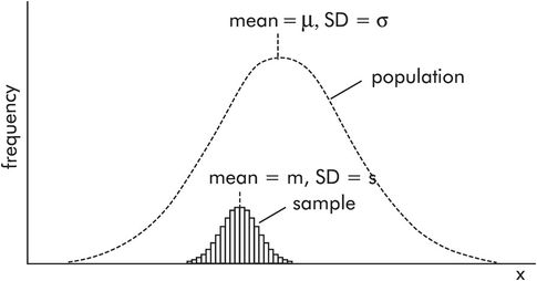
Figure 43.16 shows how a sample with mean m and standard deviation s is related to a normally distributed population with mean μ and standard deviation σ. The population frequency distribution is represented by the broken line, while the sample is represented by the smaller histogram. Note the following:
The population distribution is shown as a smooth curve because it usually covers a very large number of individuals.
The area of the sample histogram is small compared to the area of the population distribution curve, because the number of individuals in the sample is small compared to the population.
The sample mean, m, is only an estimate of the true population mean, μ. It is unlikely that the sample mean will coincide with the population mean. Therefore there will be an error (error = μ – m) in the estimated mean. A standard error of the mean (SEM) can be calculated for samples.
Standard error of the mean (SEM)
When a mean value is calculated from a sample set of data, the value obtained (m) is only an estimate of the true mean (μ). The true mean can only be calculated by measuring every value in the population. However a standard error of the mean can be calculated using the standard deviation (s) of the sample, and the number of data points in the sample (n):

If a number of samples were to be taken from a population, each sample would provide its own estimate (m1, m2, …) of the true mean (μ). These estimates (m1, m2, …) would form a normal distribution centred about μ.
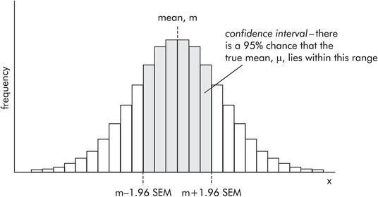
The standard error of the mean (SEM) is the standard deviation of the distribution of sample means, and gives an idea of how close the estimated mean value is likely to be to the true mean value. In order to quantify this ‘closeness’, the confidence limits have to be calculated.
Confidence limits
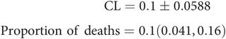
When reporting a calculated mean value, it is sometimes quoted as m ± SEM. This only gives an idea of the ratio between mean value and SEM. Consider a calculated mean value
It is not immediately apparent where the real mean (μ) lies in relation to the estimate (m). In order to clarify this, a confidence interval (CI) is determined around m, within which a reader can be confident the true mean (μ) lies. The wider the CI, the poorer the estimate. The CI is defined by two values, the confidence limits (CL). There is a 95% probability of the CI containing the true mean (μ). In a normally distributed sample, the confidence limits are calculated from the SEM by
Thus in the above example the mean value can now be quoted as
A reader then knows that the estimated mean is 10 and there is a 95% chance of the true mean lying within the range 6.08 to 13.92 (Figure 43.17).
Confidence interval and confidence limits
Describing categorical data
As discussed above, categorical data take the form of variables which are labelled rather than measured. A common situation, referred to previously, is to sample a group of individuals in whom there are only two possible outcomes (categories) of interest. In such cases the data are described as binary, and the sample is considered in terms of proportions.
Proportions
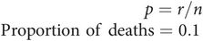
Consider a group of n individuals, in whom there exist two possible categories. Let the number of individuals in one category be r, out of the total number n. This can be expressed as a proportion r/n.
For example, 10 (r) deaths occurred out of a sample of 100 (n) admissions to ICU. The proportion of deaths (p) is given by
Confidence limits for a proportion (p) can be obtained from
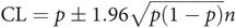
Thus in the above example the confidence limits can be quoted as
The concepts of confidence limits and a confidence interval can still be applied to a proportion, since proportions are obtained by sampling and follow a binomial distribution curve (see above).
Contingency tables
Studies are often designed to look for differences in outcome between two or more groups of patients who have been exposed to different treatments or risk factors. The results can be conveniently displayed in a contingency table. In a contingency table the column variable labels each column with an outcome, while the row variable assigns each group to a row. In its simplest form it appears as a 2 × 2 table.
Consider a study examining the incidence of influenza in two groups of patients, one treated with a vaccine and the other not vaccinated. There are only two outcomes for the patients, either they catch influenza or they do not. The contingency table thus appears as in Figure 43.18.
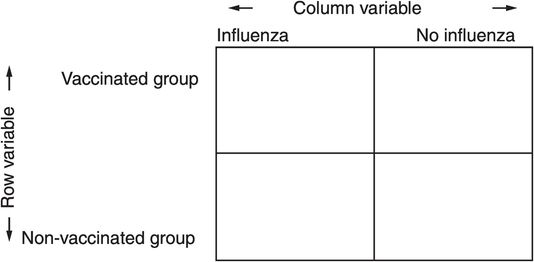
2 × 2 contingency table for influenza vaccinated and non-vaccinated groups
Larger contingency tables occur in studies examining multiple outcomes (increased number of columns) or more than two groups (increased number of rows). Contingency tables are important in the analysis of categorical data because of the use of the chi-squared test when testing non-parametric data. It should be noted, however, that many studies comparing proportions in two groups result in a 2 × 2 contingency table, which can be tested more effectively using parametric tests as described below. (see Parametric and non-parametric tests).
Data collection
Several different types of study can be designed. These can be broadly divided into:
Observational studies – In these the investigator simply observes events occurring. Observational studies may be either cross-sectional (observations at one instant of time) or longitudinal (observations following the time course of events, e.g. plasma concentrations of a drug to determine pharmacokinetic parameters).
Experimental studies – In these an investigator influences the outcome, e.g. administering a drug to observe its effect on blood pressure.
Experimental studies
Experimental studies in general may seek to relate ‘cause’ and ‘effect’ in an area of medicine, and may have been initiated by the results of a simple observational study. Many experimental studies in medicine are clinical trials which seek a specific answer by comparison, as in the comparison of the effects of two drugs, or the comparison of a drug against placebo. The results of a clinical trial may ultimately be applied in clinical practice. As discussed earlier in this chapter (see Types of trial), clinical trials vary in design and may be described as parallel, crossover, cohort or case–control studies.
The design of an experimental study must take account of a number of issues, which may confound its results. These include:
Randomisation – This refers to the method of selecting individuals for each of the groups in a study, and it is one of the important ways of reducing bias. Randomisation is usually performed by tossing a coin, using a random number generator program in a computer, or by using random number tables.
Bias – This is any systematic departure of results from the real situation, and may arise for different reasons. Observer bias occurs when an observer consistently under-records or over-records specific data values. Selection bias occurs when patients are not randomised into their study groups, or they are not representative of the population the results are to be applied to. Publication bias occurs when either favourable or unfavourable results are preferentially selected for publication. Patient bias may be introduced by patients who are trying to ‘help’ the investigators by only reporting positive results.
Sample numbers – This is an important feature when designing a study because the size of sample groups will affect the SEMs obtained on statistical testing and can therefore determine the significance of the results. Appropriate selection of sample numbers is aided by power calculation (see below).
Blinding – In a study comparing treatments and controls, observer and patient biases can be reduced by ‘blinding’ both patients and observers to the status of the individual patient under study. Double blinding means that neither the patient nor the observer knows whether the patient is a control or is receiving treatment; where only the patient can be blinded this is called single blinding.
Replication – Measurements can be made more precise if they are repeated when made and an average taken.
Types of hypothesis
Studies often compare data collected from two groups. The question asked by such studies can be reduced to proving or rejecting a simple hypothesis. There are two types of hypothesis:
Null hypothesis (H0) – there is no difference between the two groups studied.
Alternative hypothesis (H1) – there is a difference between the groups studied.
Consider a study of two groups of subjects, one treated with a new medication and the other treated with placebo. The question to be answered is, ‘Is the new medication effective?’
By convention the hypothesis to be proved or rejected is taken to be the null hypothesis. The null hypothesis states there is no difference between the groups. Thus if the null hypothesis is proved no significant difference exists between groups and the treatment is therefore ineffective. However, if the null hypothesis is rejected, then a difference exists between groups, and the treatment is effective. This leads to the definition of two types of error.
Types of error
Testing the null hypothesis leads to the definition of two types of error (Figure 43.19):
| Error | Definition | Probability | Comment |
|---|---|---|---|
| Type I | False rejection of H0 | α – also significance level | Detects false difference/effect |
| Type II | False acceptance of H0 | β – related to power | Misses true difference/effect |
| Power = 1 – β |
Type I error – rejecting the null hypothesis when it is true (i.e. finding a false difference between groups). This is equivalent to finding a positive effect of treatment when there is none. The probability of making a type I error is also equal to α, which is used as a label for the level of significance (see below).
Type II error – accepting the null hypothesis when it is untrue (i.e. missing a true difference between groups). This is equivalent to overlooking a therapeutic effect of treatment. The probability of making a type II error is called β.
Related posts:


Stay updated, free articles. Join our Telegram channel

Full access? Get Clinical Tree


